Role: Visual Lead · Team: Strategy, Copy, Design · Touchpoints: Print, digital, environmental, web, social — including Times Square
The Brief
Clorox was building an Employee Value Proposition (EVP) program to attract candidates and explain what different roles look like day to day. The ask: make a dry HR topic feel energetic and human — a company with real personality and real room to grow, visible to people who'd never set foot in the building.
My Role
I was the visual lead on a small team, working alongside strategists and copywriters who were shaping the message. While they handled the "what we say," I owned the "how it looks and feels" — building the entire visual language from the ground up: photography direction, an original illustration system, and the typography to tie it all together into one cohesive voice. That meant making decisions on everything from the color palette to how illustrated elements would pair with photography, then making sure that system held up consistently whether it was applied to a recruiting deck or a building wrap.
The Approach
The system runs on contrast — stylized photography for grounding, original illustration on top for warmth and play. Custom typography pulled the two together.
Its backbone is a set of playful blue shapes, built from Clorox's existing brand blues and affectionately nicknamed "Blue-Dads" by the team. Grounding the work in equity the company already owned made it feel native to Clorox, not bolted on.
Since the program had to live everywhere — decks, internal screens, signage, large-format environmental graphics — I designed it as a flexible system rather than a fixed layout, built to expand and recombine without losing its identity.
The Outcome
Launched in 2021 to do one specific job: make the EVP program feel human. It didn't stay in its lane. Teams across the company kept reaching for it, and over time it became Clorox's de facto visual identity — now showing up on the Clorox Company website, social media, job boards like LinkedIn and Indeed, and a large-scale Times Square digital placement.
I set out to make one HR program feel less dry. That it organically grew into the company's default look, years later and far beyond its original brief, is the part of this project I'm proudest of.
Role: Designer & Illustrator · Team: Brand Design (multi-designer pitch), Clorox brand team & Target Sales & Marketing · Outcome: Launched nationwide in Target stores
A seasonal packaging concept for Clorox disinfecting wipes, created for an exclusive Holiday 2024 launch at Target. Our team worked closely with Target's sales and marketing group to bring something celebratory and unexpected to a category that rarely gets to have fun.
A handful of designers on our team each pitched their own concept for the project — an open call to think outside the box. As the team's sole illustrator, I was often brought into these innovation efforts to add a distinct, unexpected point of view, and my concept was the one selected to move forward.
The design launched nationwide in Target stores with a major in-store footprint: a fully decorated endcap and nearly a full aisle of product.
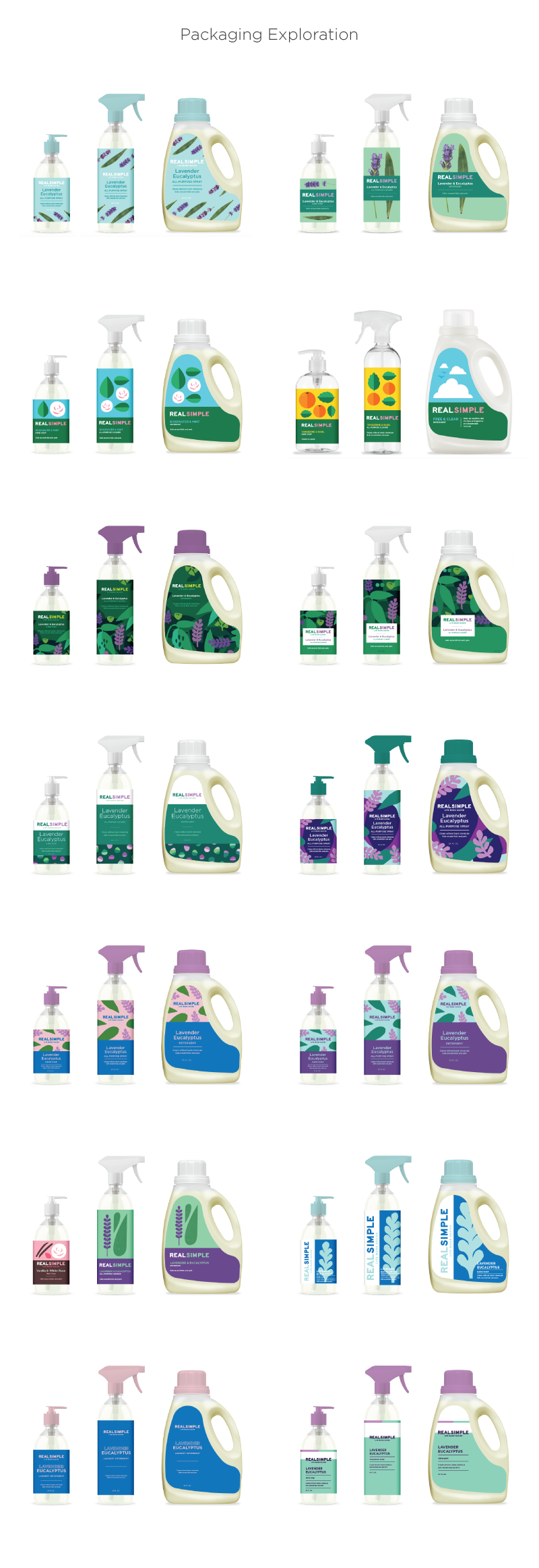
This project was a major innovation within the Clorox company. Not only was it the first new product they had brought to market in almost 10 years, but it was also an important collaboration between ourselves and the Meredith brand group who owns Real Simple magazine.
Our goal, as Clorox’s in house creative team, was to breathe new life into the outdated Real Simple cleaning line. Although mainly focused on the packaging, we approached this from a ground up perspective. Aside from the packaging aspect we also began to explore how the brand would work as a system; logo, icons, in-store assets etc.
After dozens of renditions we finally landed on a look and feel that aligned with the established Real Simple aesthetic of using bold photography on flat colored backgrounds. We took this idea and evolved and adapted it into a fresh modern approach that focused on the scents and natural ingredients that made up the cleaning formulas. The end result was joyful, fun and engaging.
Design: Myself
Illustration: Myself
Art Direction: Kean Hiroshima & Myself
Photography: Annabelle Breakey
Copywriting: Corbin Cloward & Myself
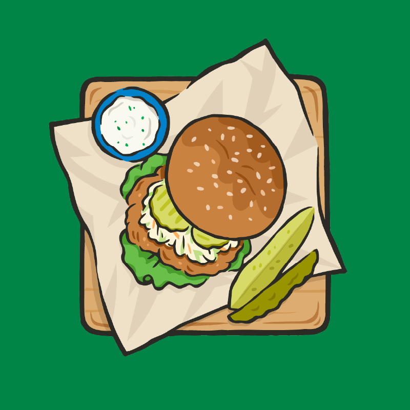
Kingsford, the century old charcoal brand, wanted to up their game in the merch department. They wanted something ‘cool, but not too cool’. Something that spoke to their core audience in a fun way. They wanted to show that the brand has a playful side. I was just the man for the job.
This group of merchandise speaks to the sensorial pleasures of grilllng. The feeling you get on a warm evening with your closest friends in your backyard, at the beach or in the park, when the smoke mixes with the smell of grass, ocean and laughter.
Now you can take that feeling with you wherever you go and let everyone know that you are ‘cool, but not too cool’.
Illustration & Design: Myself
Art Direction: Lee Fenyves & David Gilkey
Copywriting: Myself
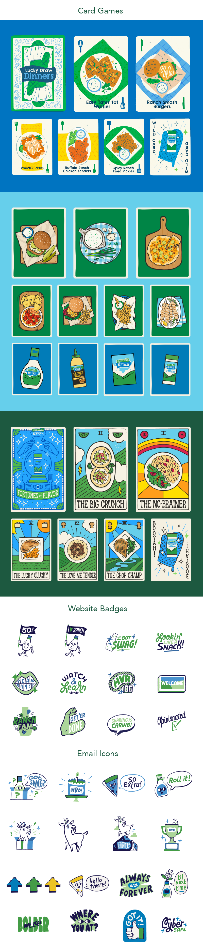
Another fun one with the folks at Hidden Valley Ranch, one of the many Clorox-owned brands I get to work with as part of their in-house creative team. 'Ranchology Rewards' is just one chapter in that relationship. An online loyalty program where superfans earn badges and unlock merch by climbing through the ranks.
I was the sole illustrator on the project, designing everything from the badges themselves to a series of online card games built around flipping and matching for points and prizes. That meant logos, icons, and every individual card, working alongside a creative director to keep it all aligned with the brand.
The card games gave me room to play with tone. Some leaned into popular recipes, others went more playful with a tarot-card vibe, which is a sentence I never thought I'd write about ranch dressing.
What started five years ago is still running strong today. Unique, whimsical and a little weird in the best way. And I'll fully admit to keeping a soft spot for one particular badge, but I won't say which.
Design: Myself
Illustration: Myself
Art Direction: Brian Ho & Myself
Burt’s Bees, has been a leader in the natural skin care world for almost 40 years. When they approached me to create a line of packaging for their Holiday gift sets for Target I jumped at the chance. Getting to work on such a big project for a household name was, and still is, an honor.
The end result was a magical set of what felt like little treasures. Each set unique in form and design. It was a joy to see this project come to life and see these products hit the shelf.
Over the years we have developed a close relationship and they are one of my favorite brands to work with.
Design: Myself
Illustration: Myself
Art Direction: Carl Mazer
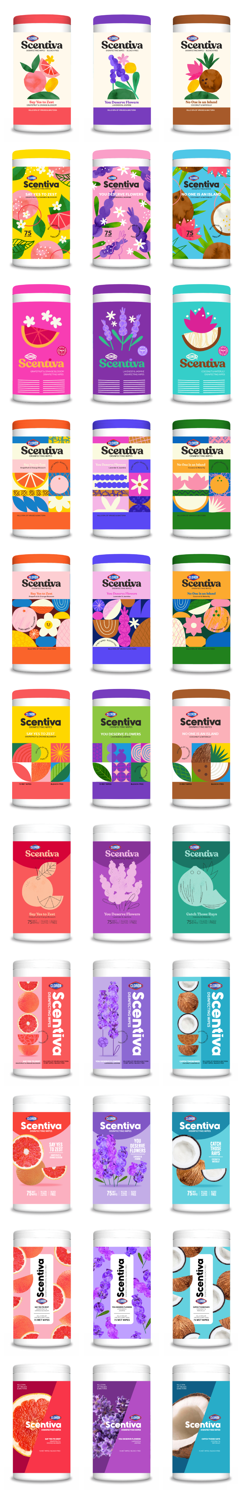
This was another innovation project done at Clorox. The scent based cleaning line, Scentiva, wanted to update its look to appeal to a younger, more multi-cultural audience. This was basically a rebranding effort, but focused mainly on the packaging. As a designer on this project I was encouraged to take off the guardrails and really explore what could be done.
I absolutely love being given the opportunity to reimagine where a brand might go and to bring it into a more relevant space. My love of typography and illustration gives me a unique perspective on this process and allows me to bring maximum joy to the table.
Although none of these designs made the final cut, I like to think I helped to form some new ideas within the brand and to allow room for growth in the future.
Design: Myself
Illustration: Myself
Art Direction: Kean Hiroshima & Myself
Copywriting: Julie Gordon
Another amazing collaboration between the folks at Burt’s Bees and myself. I absolutely love working with the team over there. They make big grueling projects like this feel like a walk in the park.
Burt’s Bees set out to establish a new line of products for babies and mama’s. This was a massive undertaking that spanned about 8 months or so. Tons of exploration on which animals would best suit each product and what pose would be best for each form. This was definitely a labor of love.
The end result is one of the sweetest, cutest line-up of products I have had the privilege of working on. Unique, whimsical and innovative; all while fitting nicely into the brands existing portfolio. The products themselves are amazing too. We use many of them regularly in our household.
Illustration: Myself
Design: Mariko Harashima
Art Direction: Carl mazer
Over the 100 plus years that Clorox has been in business it has established itself as a trusted family brand, bringing safe and effective cleaning solutions into millions of homes. It’s efficacy was never more welcomed than during the height of the Covid-19 pandemic. Families depended on Clorox wipes to keep their homes and children safe.
In 2019 I worked with Clorox to develop a Back-to-School packaging system for their wipes. This system was implemented across a wide range of bundled packs.
We really wanted the design to tie into the STEAM program, but in a subtle way. STEAM is an approach to learning that results in children who take thoughtful risks, engage in hands-on learning, persist in problem solving, embrace collaboration, and work through the creative process.
The result was a unique design with major shelf pop that built brand awareness. Because who says that cleaning and safety can’t be fun?
Design: Myself
Illustration: Myself
Art Direction: Kean Hiroshima
A collection of personal lettering pieces.
To me the use of lettering and typography is one of the most interesting and varied ways to bring life to a designs and brands. I find it very similar to illustration. Every letterform and style tells a story. Each have their own individual charms and energy.
Exploring these styles is an endless source of inspiration for me. My love for lettering started out of necessity, when I started doing merch work for bands and brands in my early freelance illustration years. From there I had a short stint at the renowned SF based sign painting company New Bohemia. It was there that I really gained an understanding and respect for the craft.
‘Forever bettering my lettering’.
This was a passion project I did back in 2018 at a time I was in between jobs. It’s very important to me to remain inspired and to keep moving ahead.
I wanted to explore what I thought a good beer brand would look like. Given my penchant for mid century design, clean bold graphics and interesting typography what you see is a bold design with a bit of wit and whimsy.
The mascot horse was inspired by Greek imagery, but brought into a mid century aesthetic. The typography choices of an off kilter, stylized black letter form paired with a super clean sans serif gave the brand a unique look, while still being legible. And the color palette is warm and saturated, leaning masculine.
The design system is meant to be super easy to understand, with a predictable rhythm and flow. The colors change across various flavors but placement and hierarchy stays consistent.
Although this was created years ago, it remains one of my favorite passion projects to date.
Art Direction: Myself
Design: Myself
Illustration: Myself
Hand Lettering: Myself
An exploration of logo lock-ups to celebrate the 60th anniversary of Cost Plus World Market. The final asset was to be used company wide including in-store signage, online marketing, mailers, email blasts etc. What you see here is about half of what I produced.
Art Direction: Myself
Design: Myself
Various concepts for a 'Food Facts' program of in-store graphics for Cost Plus World Market. This project intended to tell stories about various global food favorites in a fun and interesting way. The exploration took us through a wide variety of styles, many not shown here. There were very few constraints in this early exploration. The main goal was to capture a shoppers attention long enough to get them to stop and read these signs as they strolled down an aisle.
A big part of my job was in reproducing various styles of print and advertisement throughout history and different cultures. Whether it was ghost signage on an old barn or letterpress printing from the 50’s, I strived to replicate these style and aesthetics in a fresh way that would fit within the existing branded atmosphere of the Cost Plus shopping experience.
Art Direction: Jeffrey Pelo
Design: Myself
Illustration: Myself
Copywriting: Myself
Concepts for a poster that would serve to inform and remind employees of Cost Plus World Markets’s goals and objectives. Shown here is small portion of my exploration of styles. The objective was to create a fun and engaging piece that reflected the companies playful and worldly vibe.
Art Direction: Jeffrey Pelo
Design: Myself
Illustration: Myself
A collection of in-store signage created for seasonal and campaign-driven sections at Cost Plus World Market. Each piece was designed to set the tone for its section and feel as though it had been plucked from a specific time and place — built with hand lettering, custom illustration, and rich texture, and a close attention to historical detail.
Signage was rarely a standalone piece. Most lived within larger systems spanning endcaps, aisle markers, banners, and arches — and in some cases, entire in-store marketplaces built from the ground up.
Art Direction: Jeffrey Pelo
Design: Myself
Illustration: Myself
Hand lettering: Myself
A collection of apparel designs created for a wide variety of clients from clothing brands to world famous musicians. One of my favorite things about this type of work was helping artists such as Paul McCartney, Tupac, Billy Joel and Katy Perry to reach new audiences and expand upon their brand. To date I think I have done over 200 apparel designs.
Design: Myself
Illustration: Myself
Hand Lettering: Myself